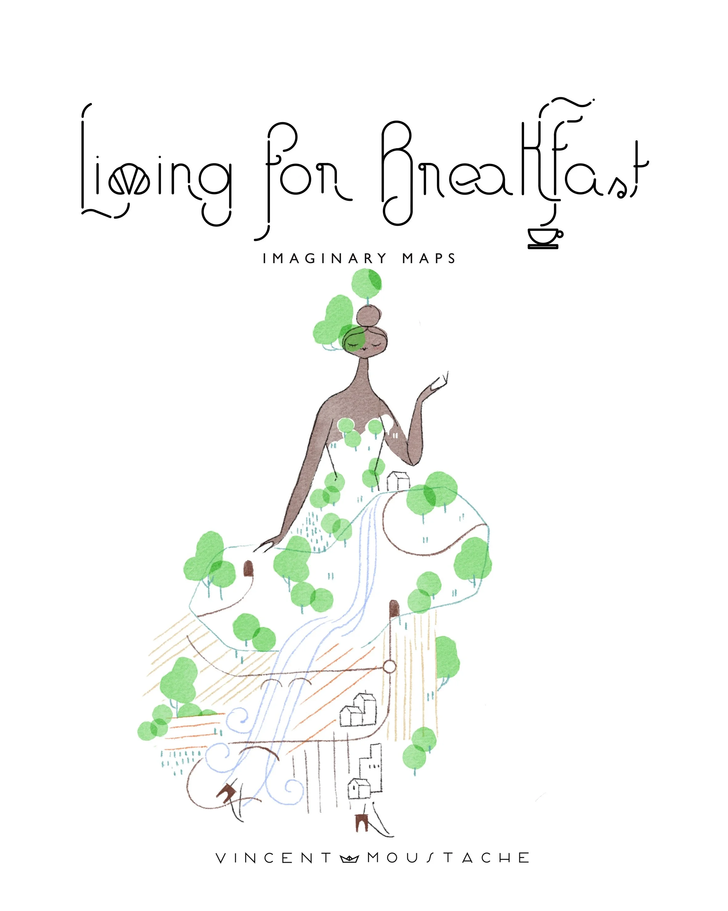
IMAGINARY MAPS
PLAYLIST: "UNICORNS AT THE OPERA” LINK
Text by Vincent Moustache with AI assistance for research, proofreading, and translation. Illustrations by Vincent Moustache.

Dear Croissant,
THE MAP, DORA HAS ONE, DO YOU HAVE YOURS?
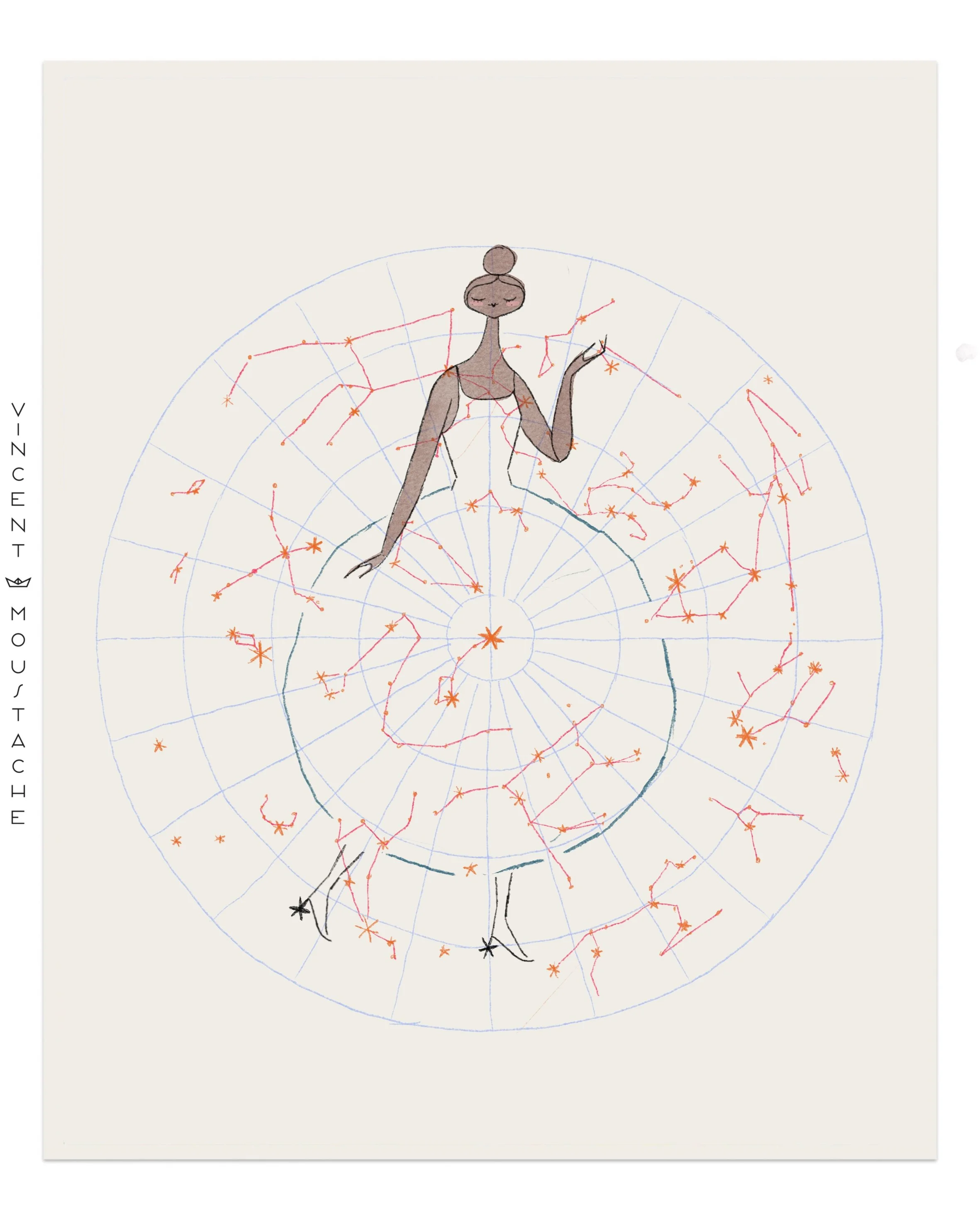
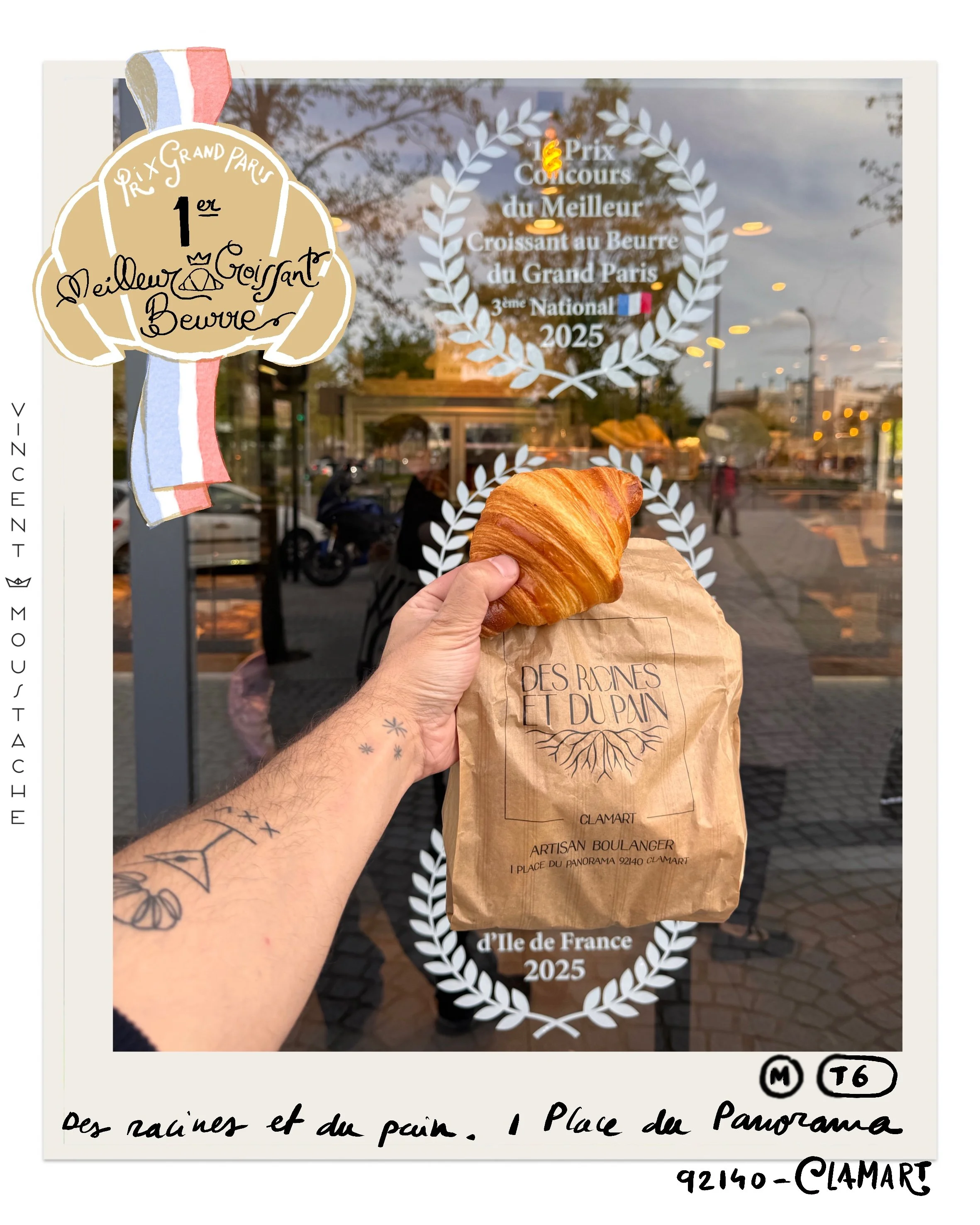
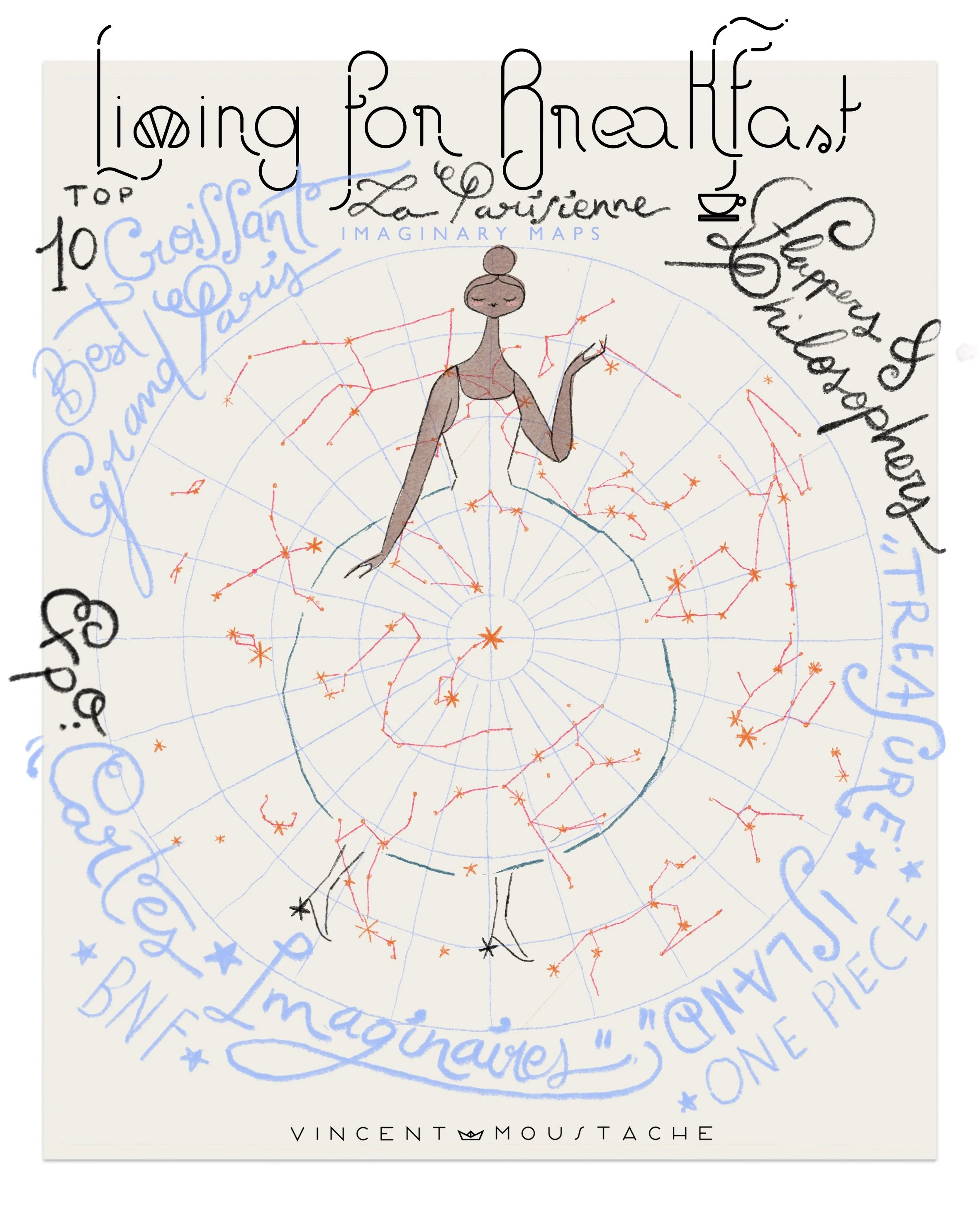
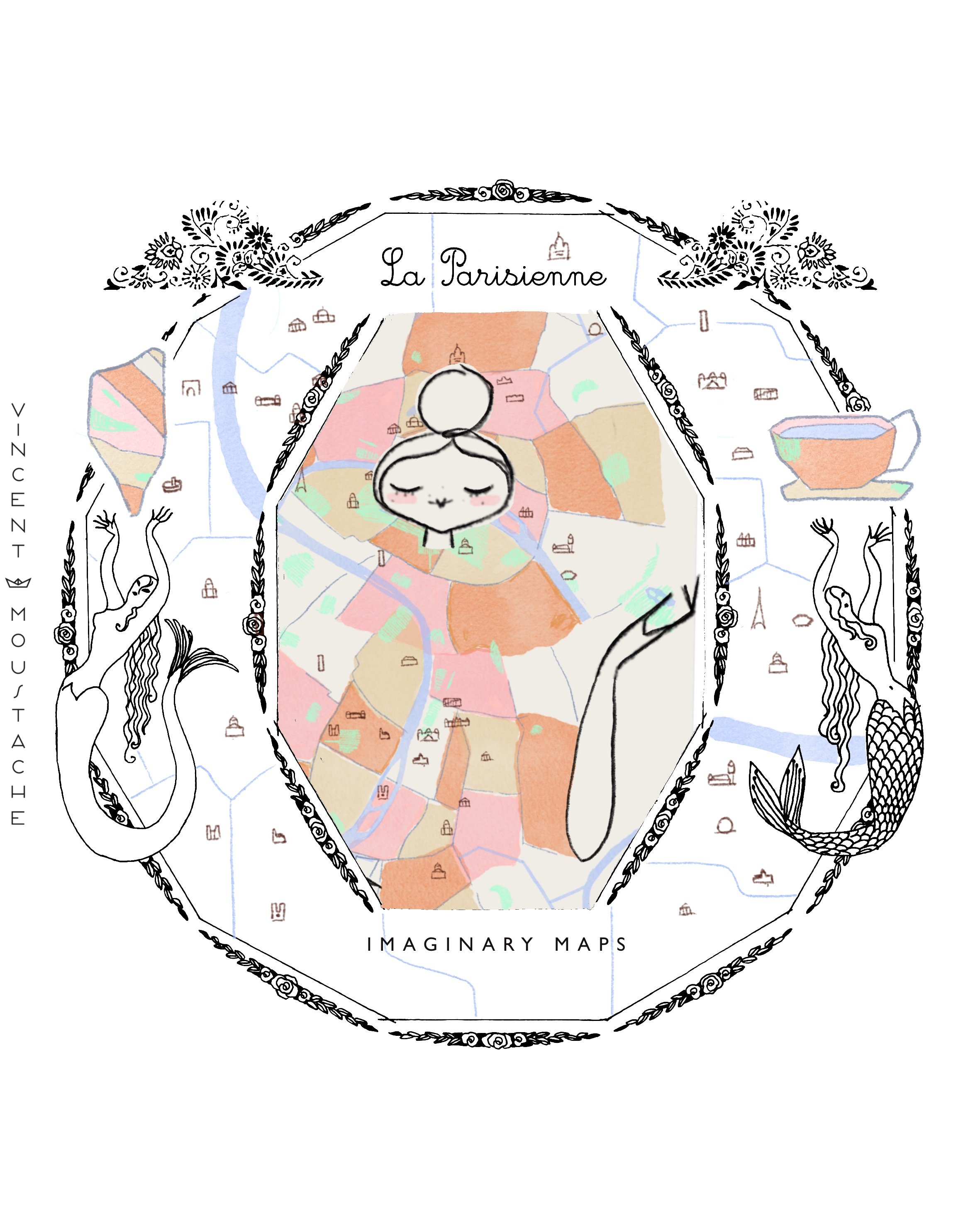
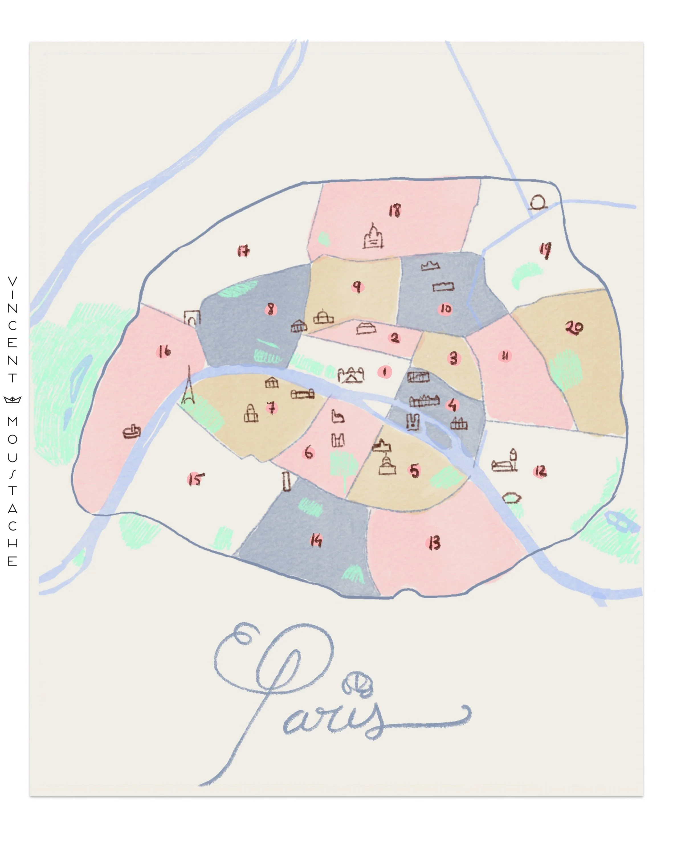
Where are you right now? If you were to send me your location, what you would send me is a map; you would send me a drawing to explain to me where you are. That drawing is a simple and imaginary explanation of where you are, because reality isn't that simple and colorful. This Sunday at LFB we locate ourselves: Where do the best croissants in Paris live? We talk about maps and, while eating the top 10 croissants of 2025 according to a butter brand, we explore the city we love so much.
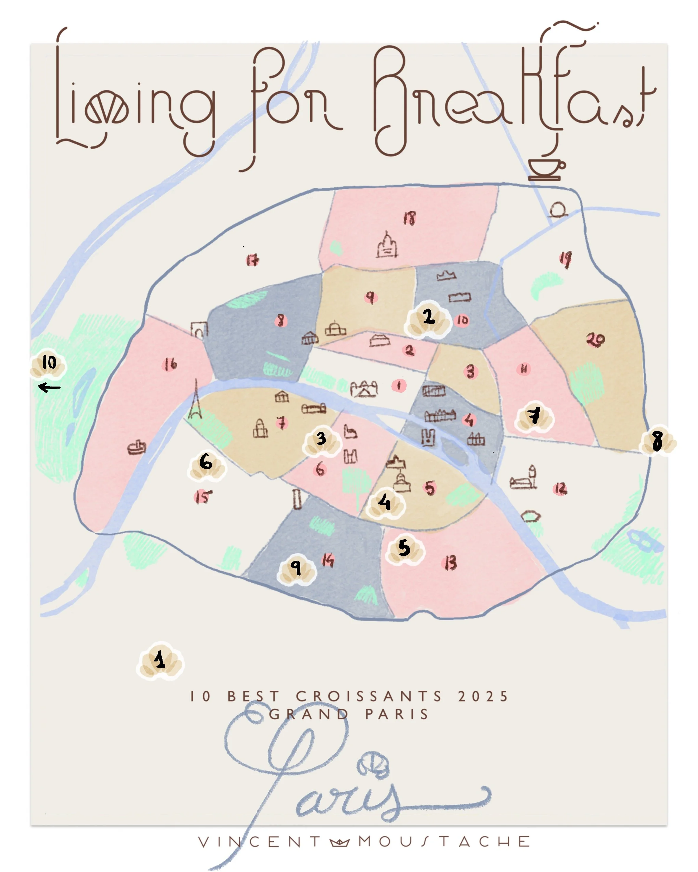
10 BEST CROISSANTS IN PARIS 2025
Map and list of the top 10 butter croissants of 2025 in Greater Paris sponsored by Charentes-Poitou AOP butter. List and Map!!
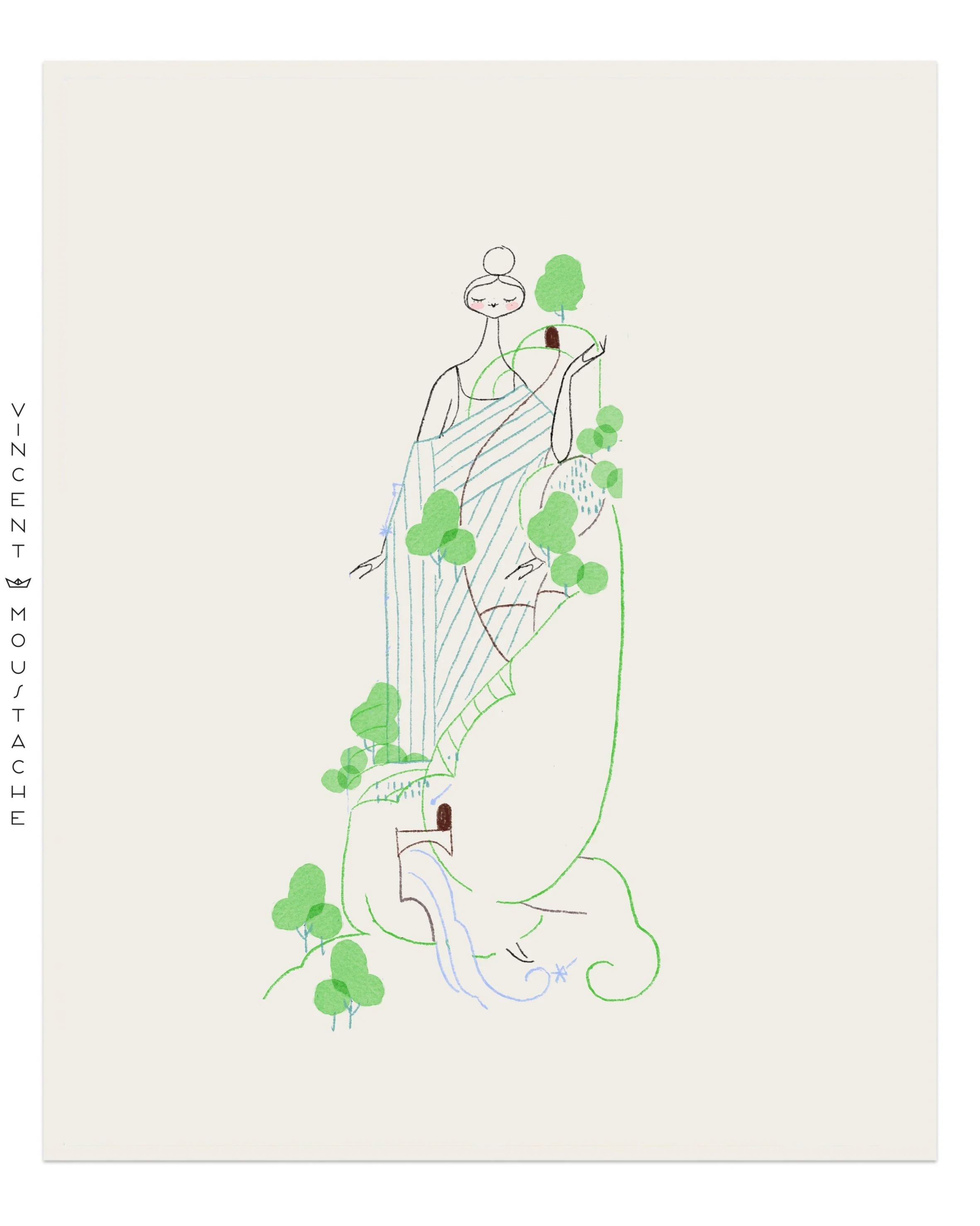
A MAP IS NOT WHAT YOU SEE, IT IS A PLACE YOU IMAGINE
Maps are a mental image of a place. It is an illustrated project, but at the same time, it has a conceptual use. Literally, it is about creating a small illustrated universe where users can stroll, guide themselves, and imagine themselves as just there. The map represents the space you can’t see all at once: not only the location, the way to move inside, the direction, the point of interest, the danger points, but also its aesthetics, its values, and its offerings. For this type of project, illustration is ideal because otherwise, it would be impossible to represent so much information while keeping it useful and aesthetically pleasing. The role of illustration is to convert abstract ideas into understandable concepts.
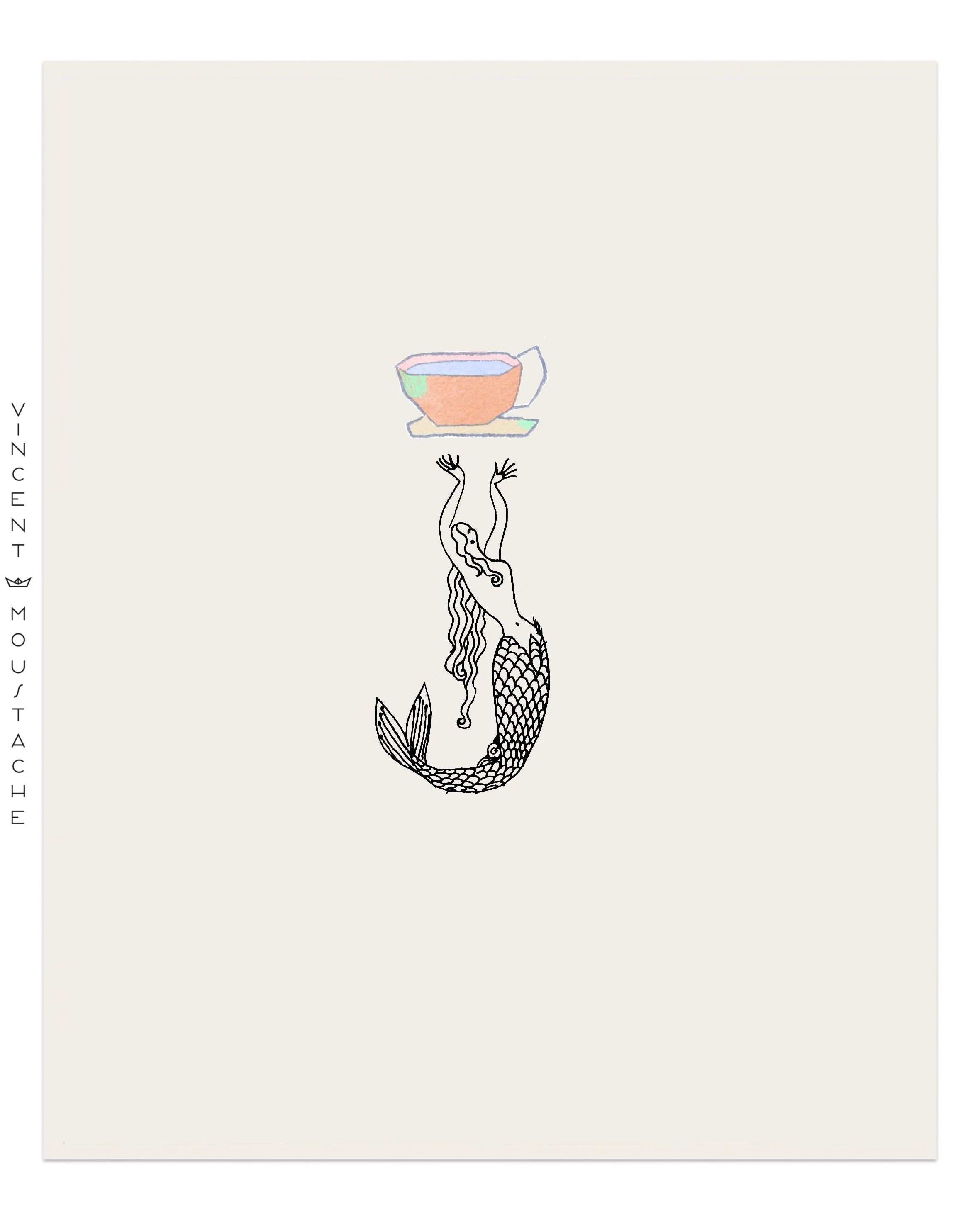
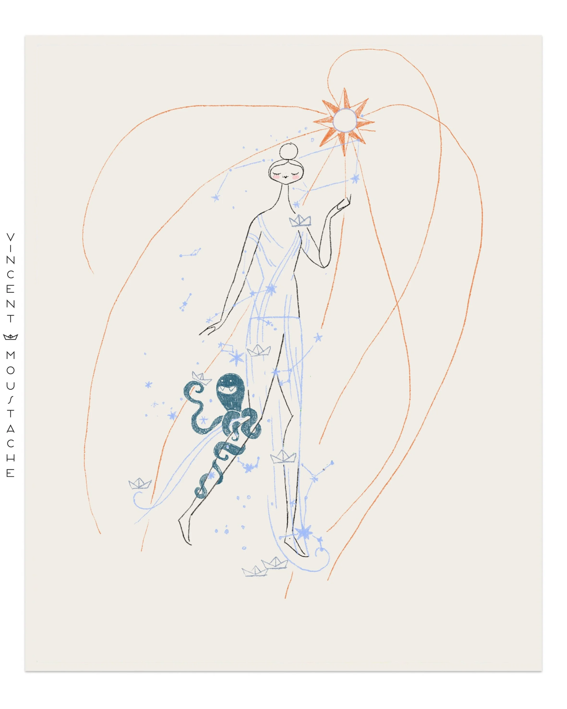
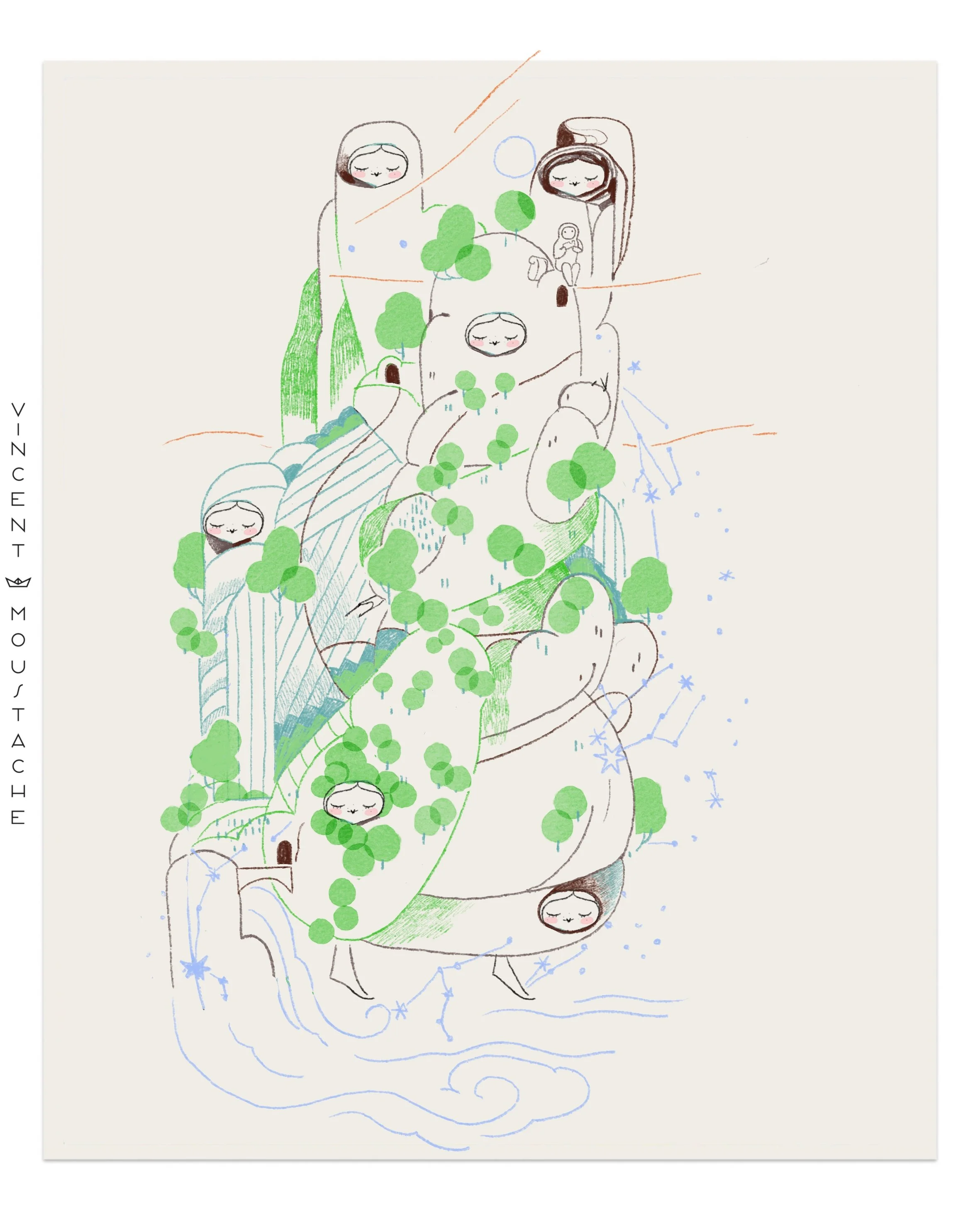
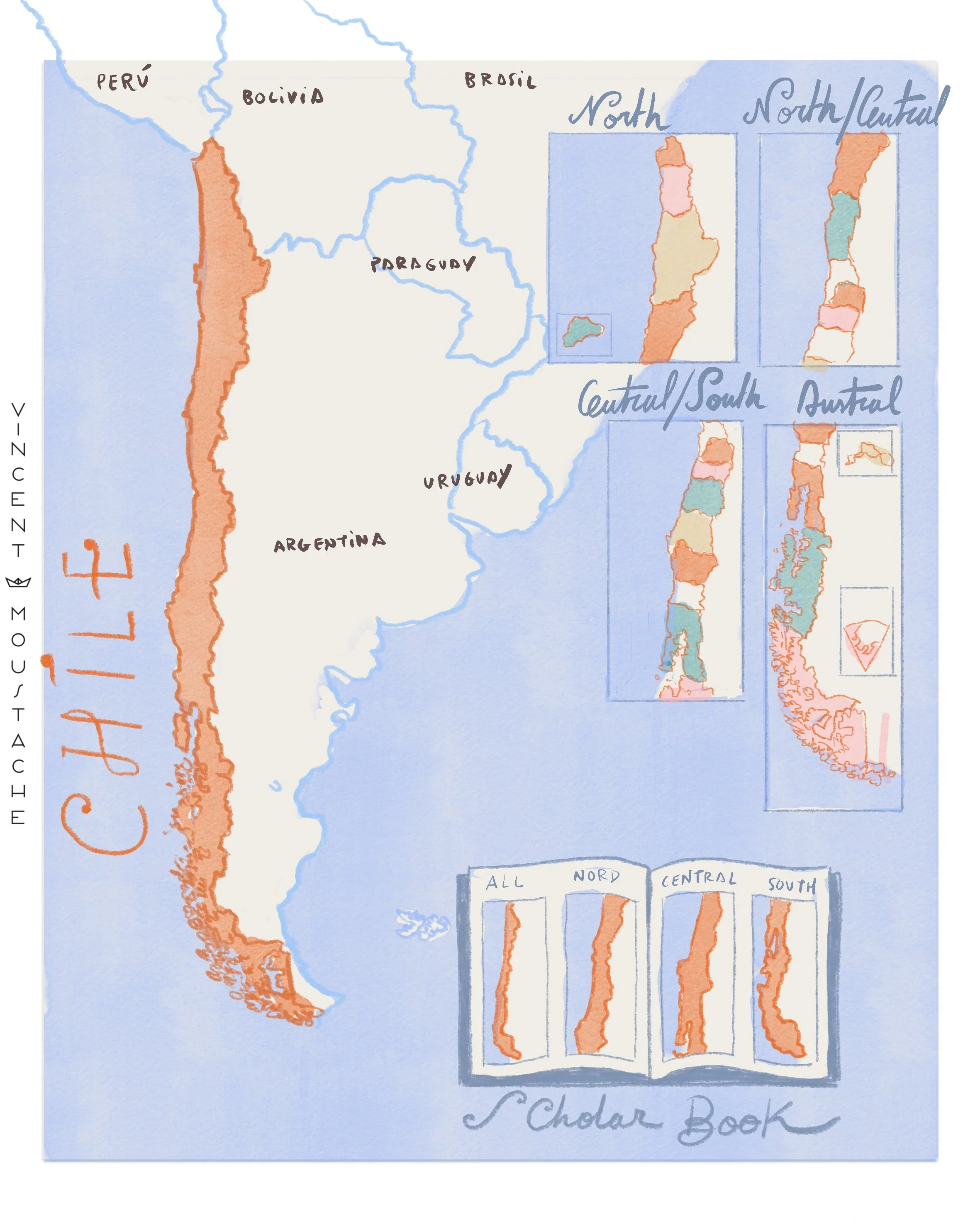
CHILE IS SO LONG IT DOESN'T FIT ON A SINGLE PAGE
Traditionally, the country of Chile is presented divided on maps because it is so long and narrow that it couldn't be read properly within standard rectangular formats.
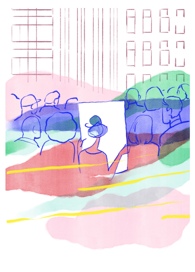
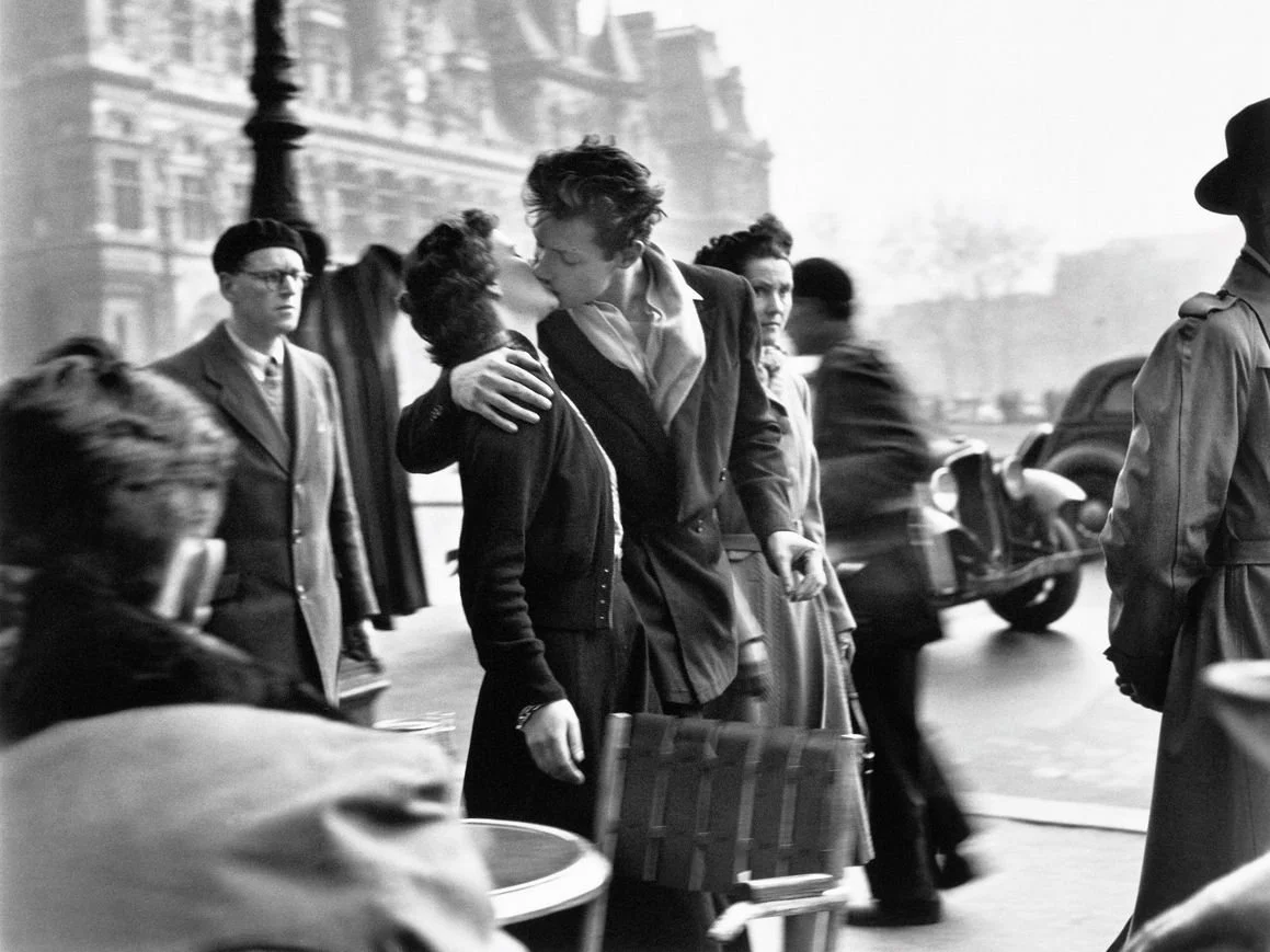
FREEZING TIME IN PUBLIC SPACE
Preparing this article, the first image that came to my mind was the famous photograph "Le Baiser de l'Hôtel de Ville" (The Kiss by the Hôtel de Ville) by Robert Doisneau, 1950. A map, much like that photograph, is a romanticization of public space. I imagine someone reading the map right in the middle of everything that is happening around them in Paris—cars, people, movement. One person in focus, while the rest of the world is in motion. What I love about that photo is how it freezes time while simultaneously capturing movement; I think that is an experience we can all relate to when walking through any city.
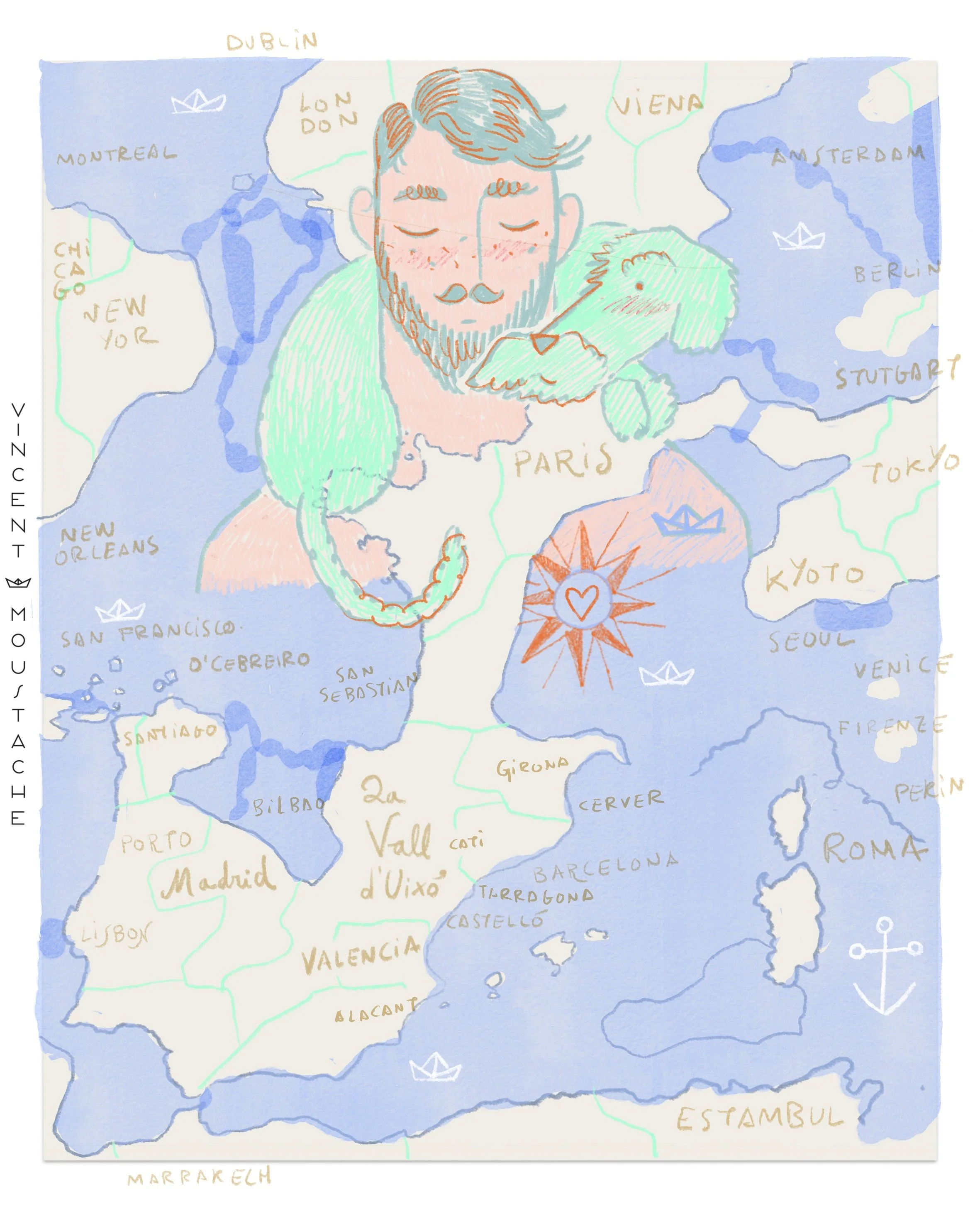
THEY SAY YOU SHOULD RETURN TO WHERE YOU WERE HAPPY: EMOTIONAL MAPS
Not all maps are geographical; the ones we use most often are invisible and emotional. We have maps that trace our lives: where we grew up, where we studied, where we found love. Those of us with very vivid dreams have maps of our dream places that we often remember and return to. Not all maps are what you have on your phone.
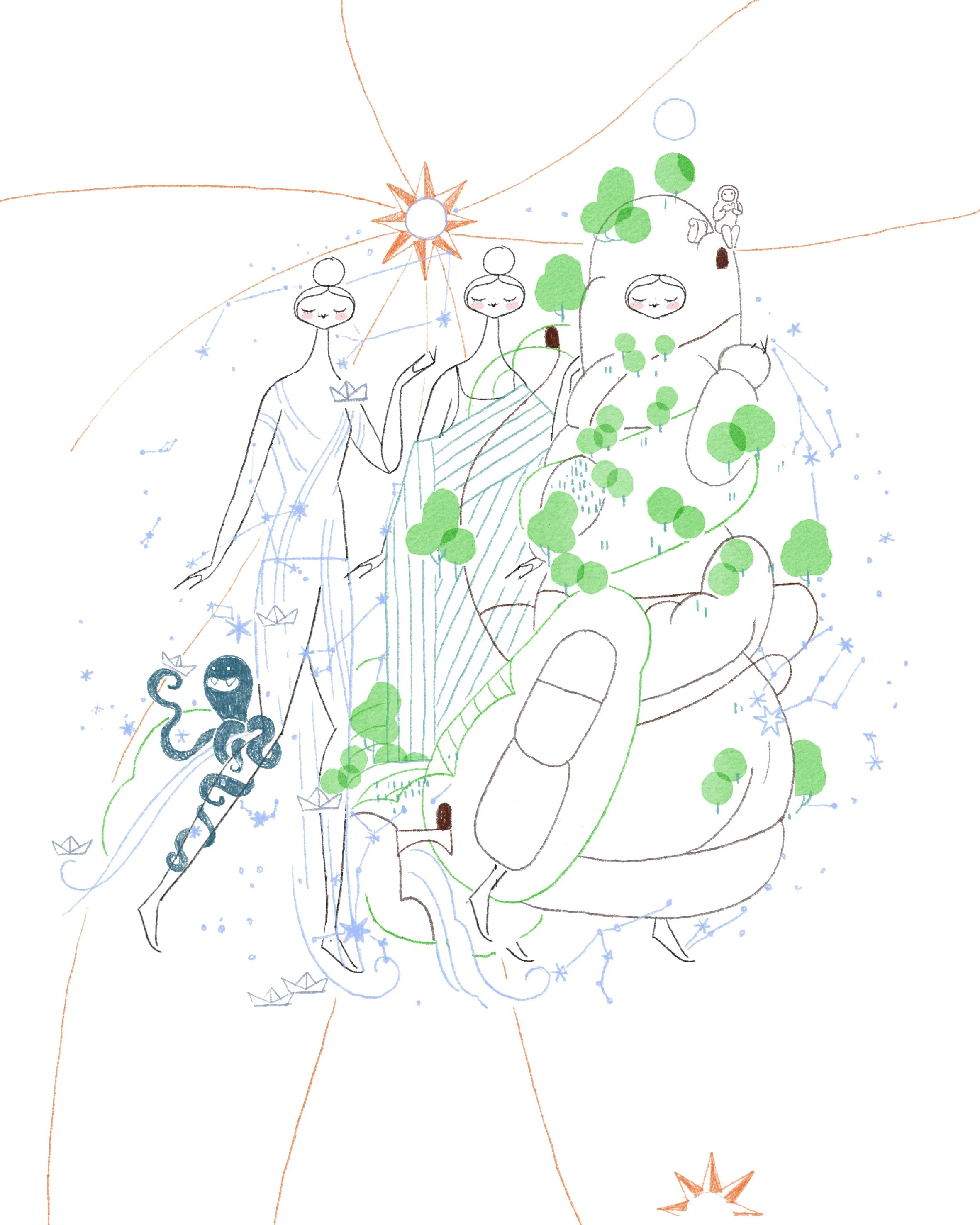
FICTION NEEDS MAPS TO LIVE IN.
J. R. R. Tolkien needed to draw the map of his own world so that his characters could live in it, and this very map is the foundation of everything that happens to his characters. The same is true for the Wizard of Oz, One Piece, Game of Thrones, The Hunger Games… the map is the silent character that sets everything off. Not only the desire to possess the world itself; the geography itself creates the encounters and misfortunes between the characters.
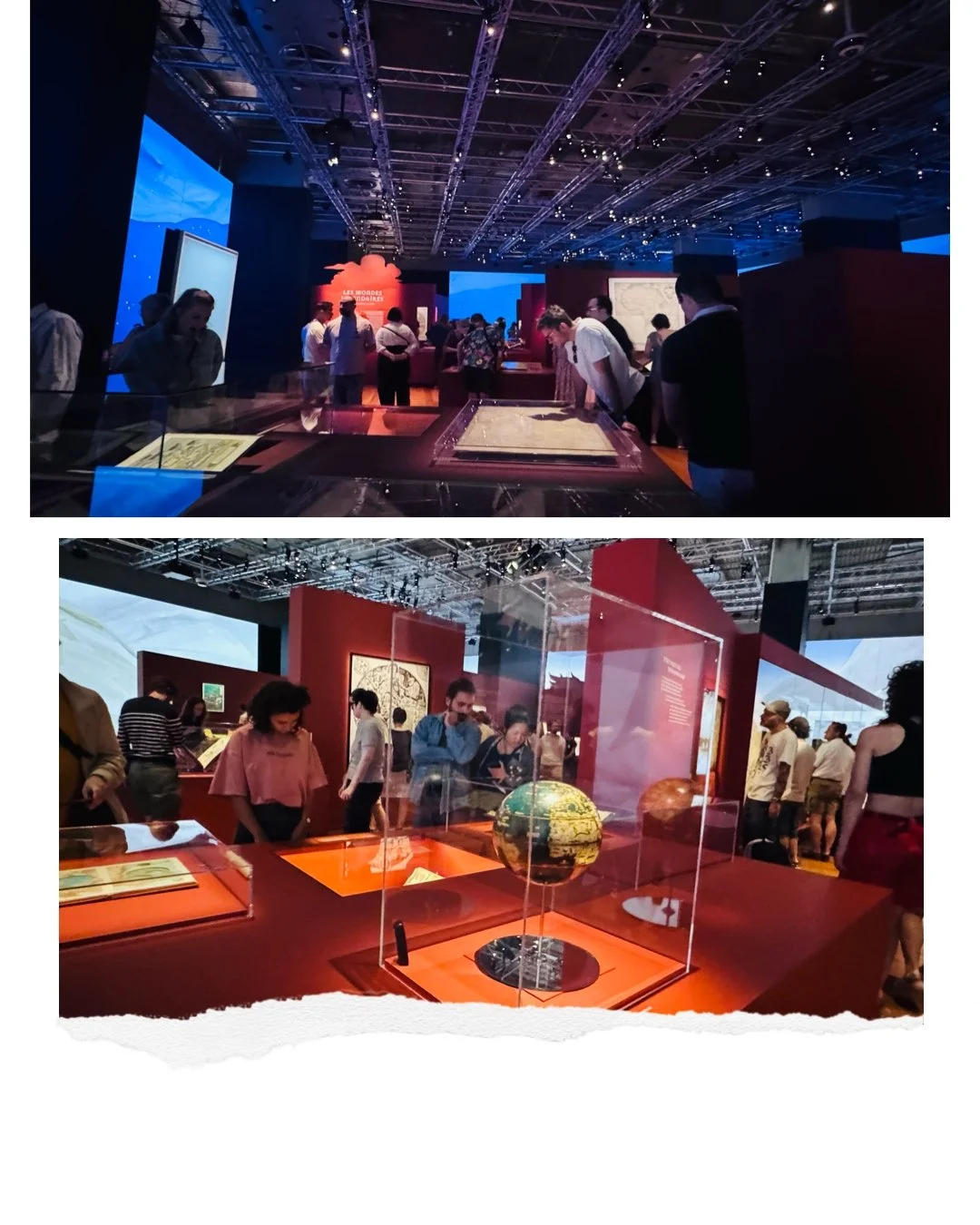
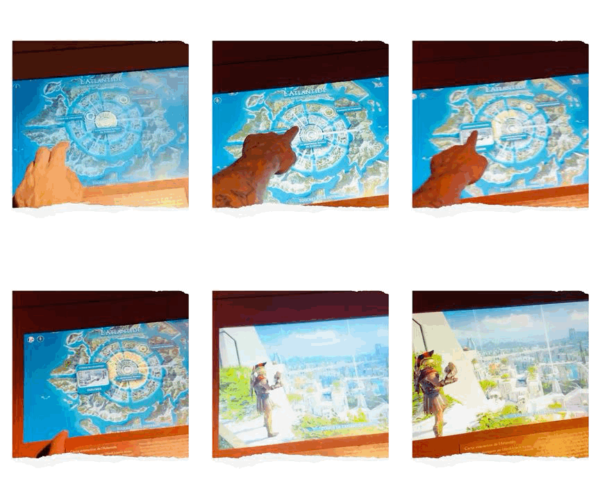
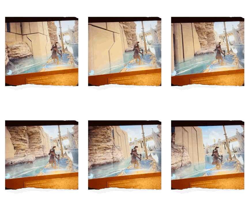
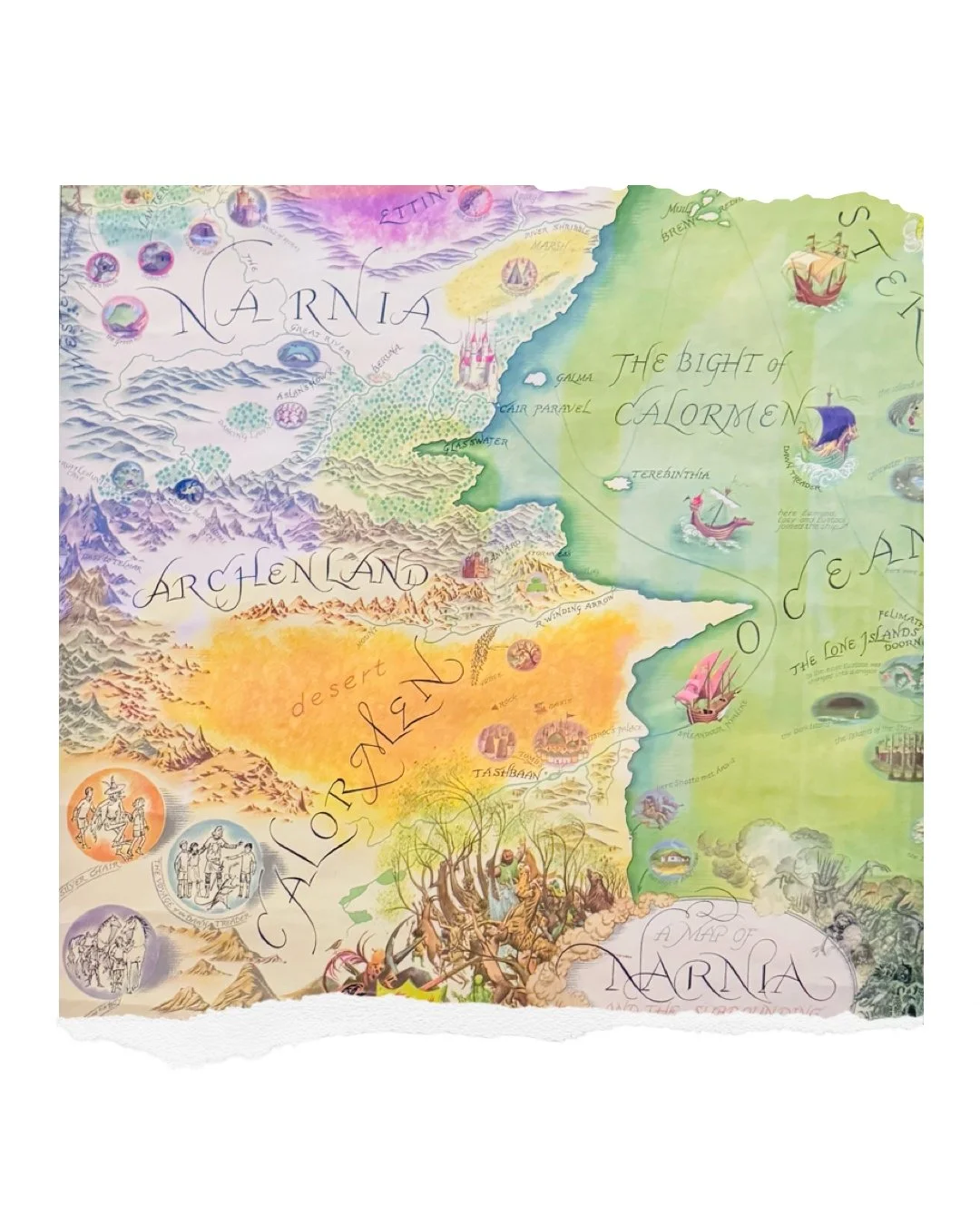
EXPO: « Cartes Imaginaires. Inventer des Mondes ».
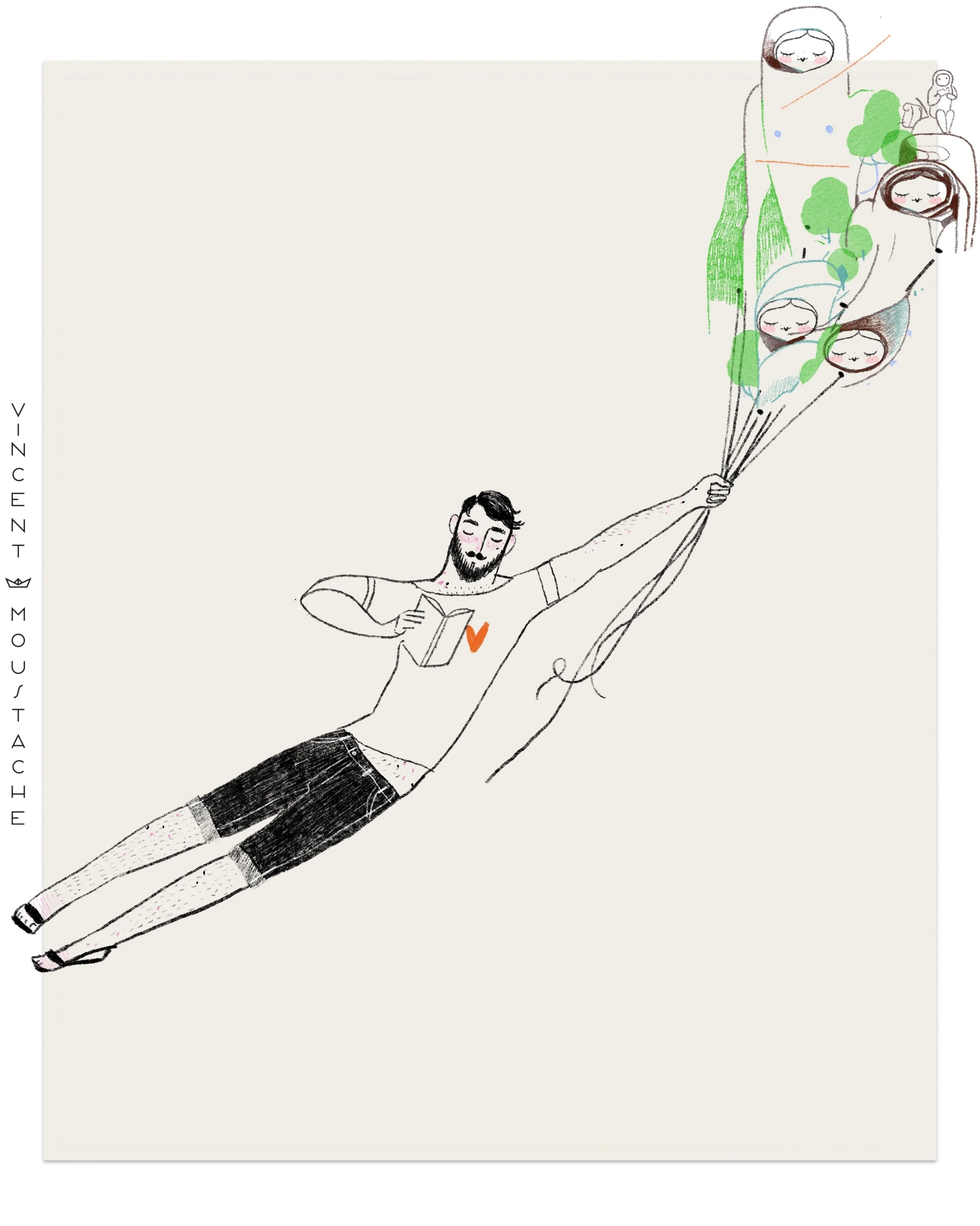
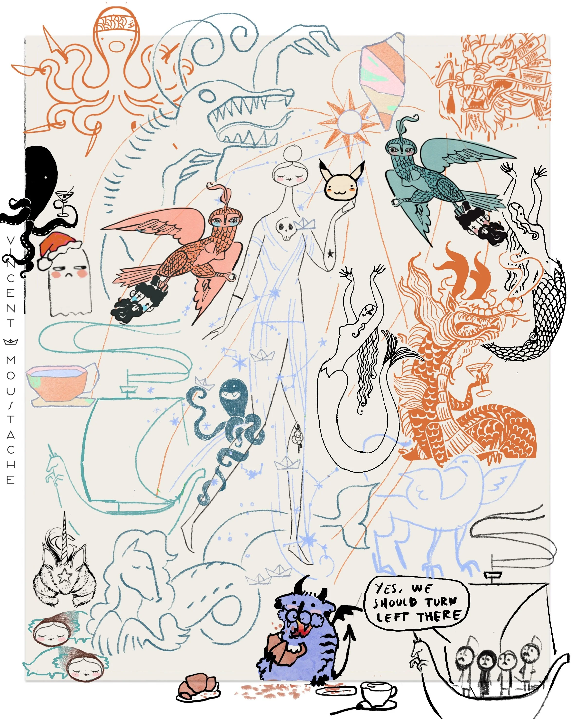
When Renaissance explorers drew maps of the world, they included imagination and the unknown in their maps as part of reality itself. I invite you to navigate with me and Constanza through the history of map concept design and through the exhibition at the BnF « Cartes Imaginaires. Inventer des Mondes »: the map from the Wizard of Oz, the Lord of the Rings map, Renaissance maps showing the exact location of paradise and hell.
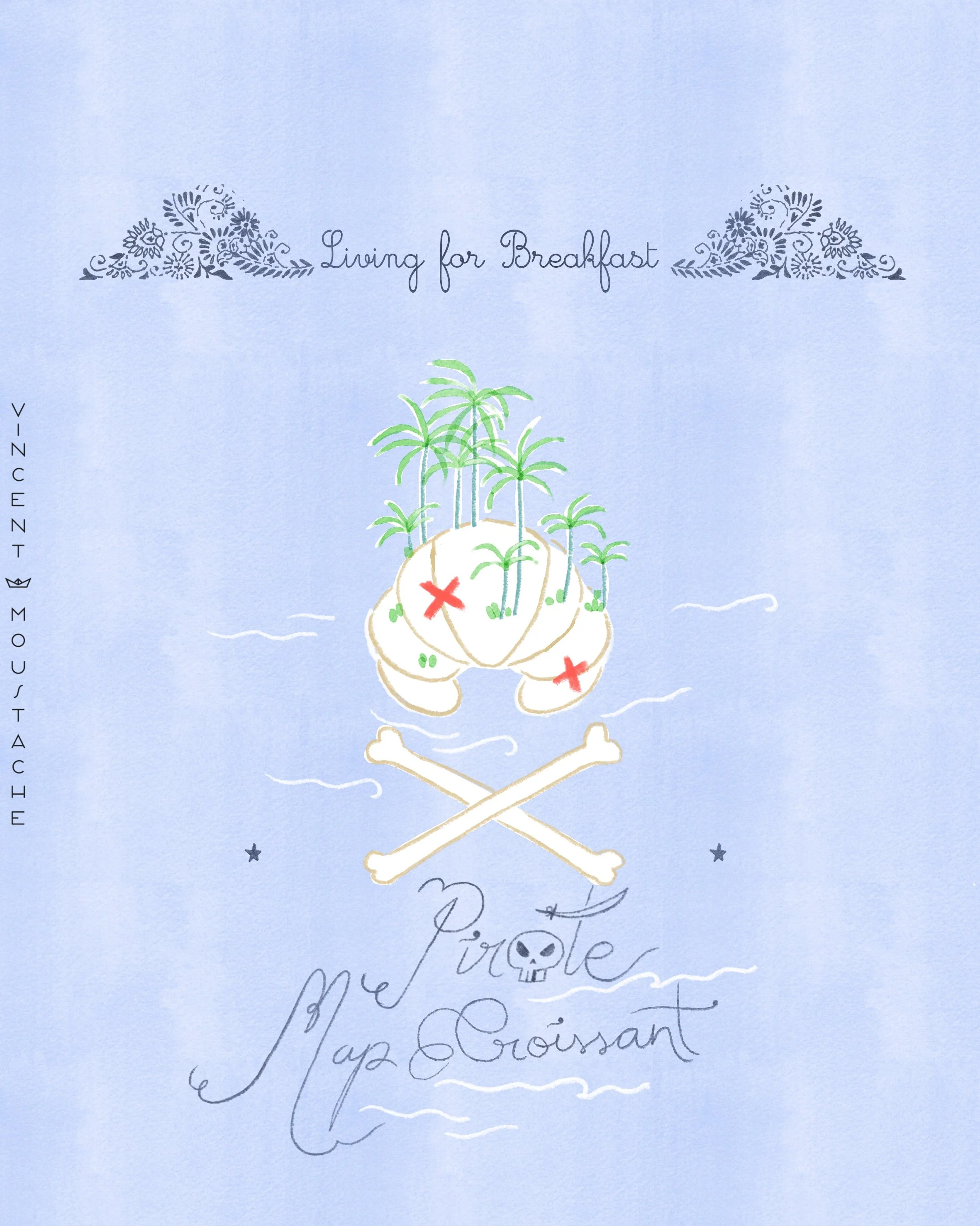
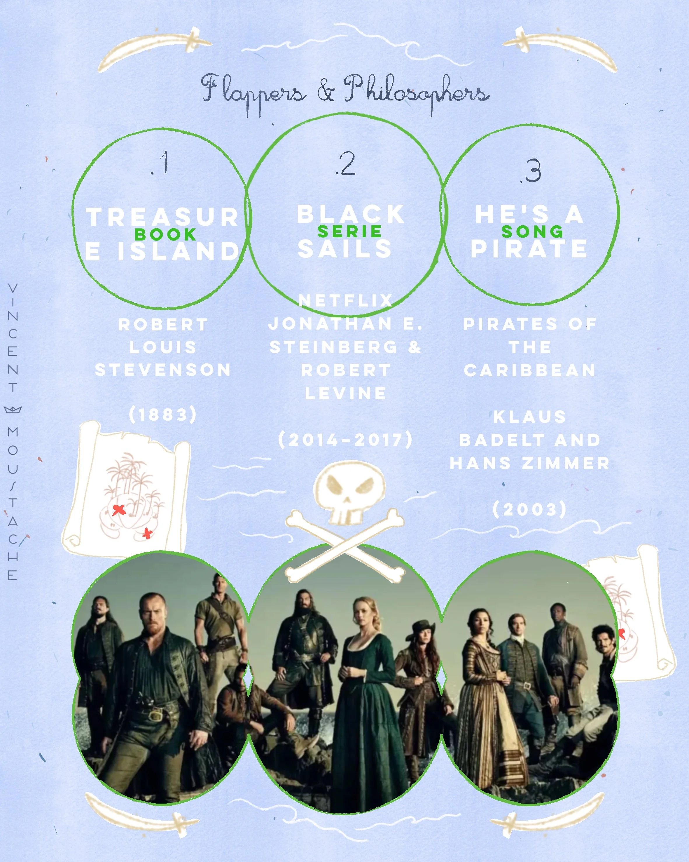
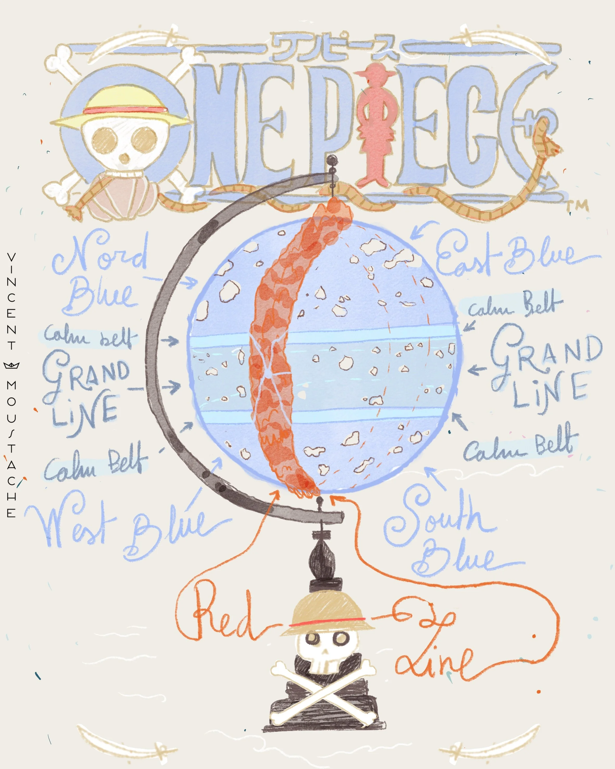
MANY STORIES START WITH A CHARACTER FOUNDING A DOCUMENT: SOMETIMES A BOOK, A PICTURE OR A MAP.
A family secret? Classified reports? The treasure map? If you want to find your treasure, you can follow the clues in Flappers & Philosophers with an exciting list of pirate literature that includes the blockbuster phenomenon ONE PIECE!
(1931)LE METRO
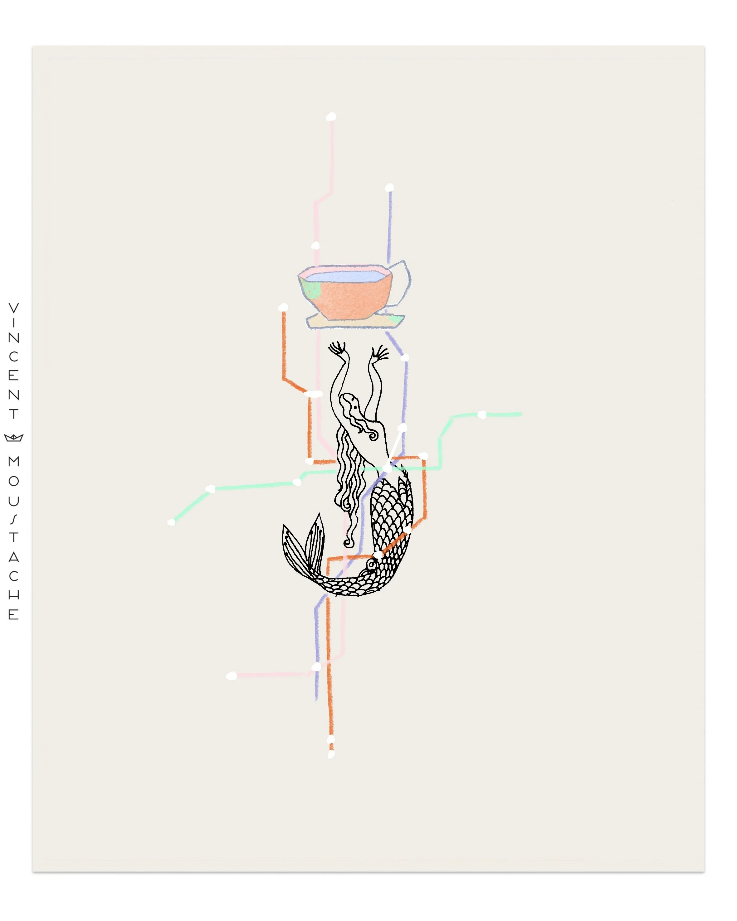
All of us city rats know that locating places, monuments, services, and friends' houses is linked to the subway. The subway creates this mental map image thanks to its stations, times, and commutes. You can literally and mentally measure any distance in the city in subway stations and transfers. In Paris, saying RER is a guarantee of a long distance from the center, although if it's far out in the suburbs, saying RER means it is accessible and "not that far." The beautiful thing about the subway is that it is nothing like that in reality; it is a maximum simplification of train routes and the city itself. Underground trains, just like the roads above, are irregular; they don't go in a straight line from point A to point B, but that would be too much information for an easily understood map. We owe the creation of the subway map to the London Underground (1931) and it is based on the natural movement of the city from north to south and east to west, maintaining 90º and 45º geometric axes. One of the current debates among graphic designers is whether this cardinal design logic can be applied to other cities where movement is, for example, circular. The subway map is a great summary of how we move through the city and how we understand it—which areas have been cared for and which others have been abandoned by the administration.
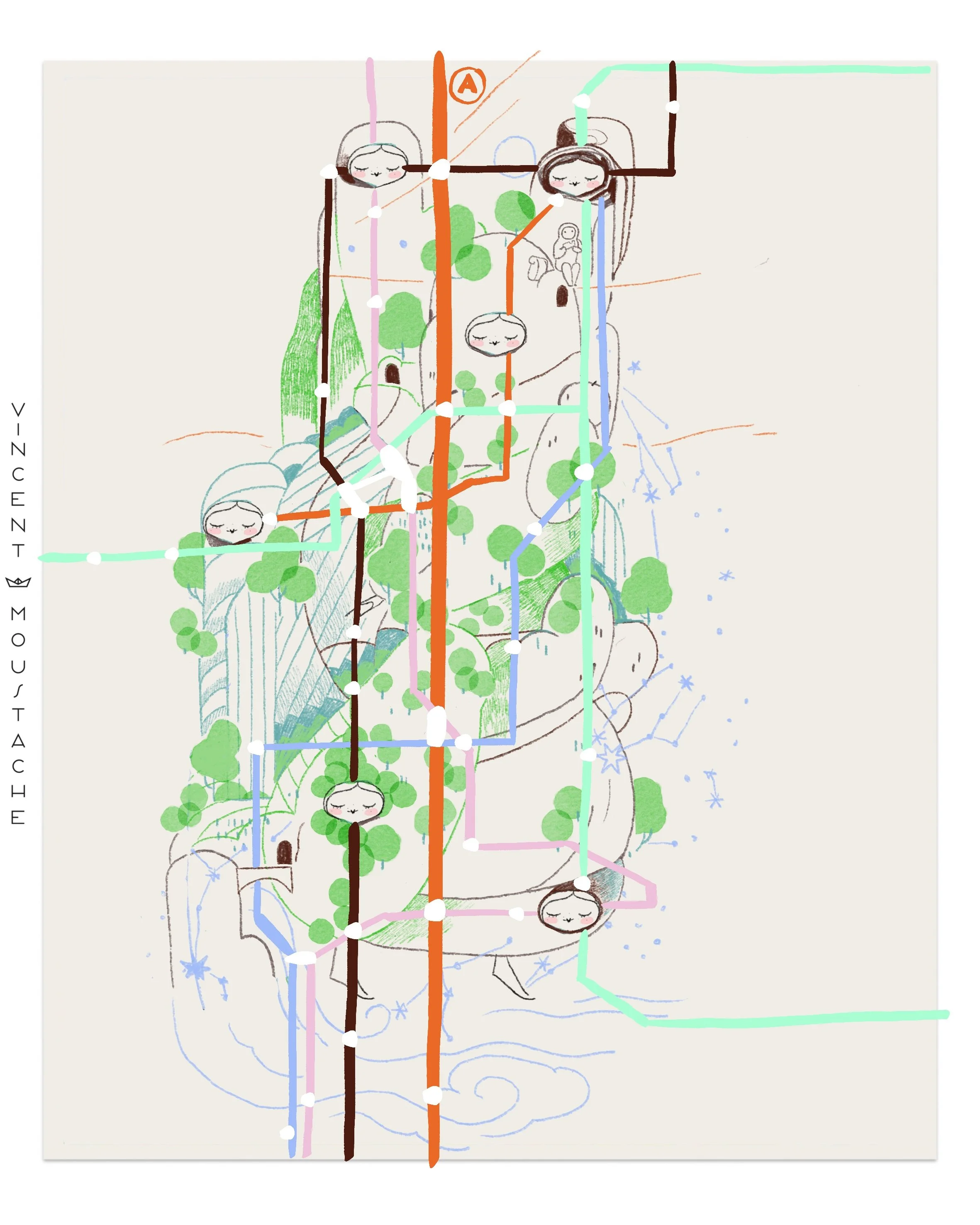
THE COLORFUL MAP
Color codes are essential when designing and reading a map. In the subway map, for example, they allow us to distinguish lines—colors that the tracks themselves do not have. On geographical maps, they indicate elements: water, vegetation, mountains, snow, desert. In news reports, the map takes on the corporate colors of the media channel. Color is the first piece of information that reaches us—from afar, silently—and surely the one that gives us the most information.
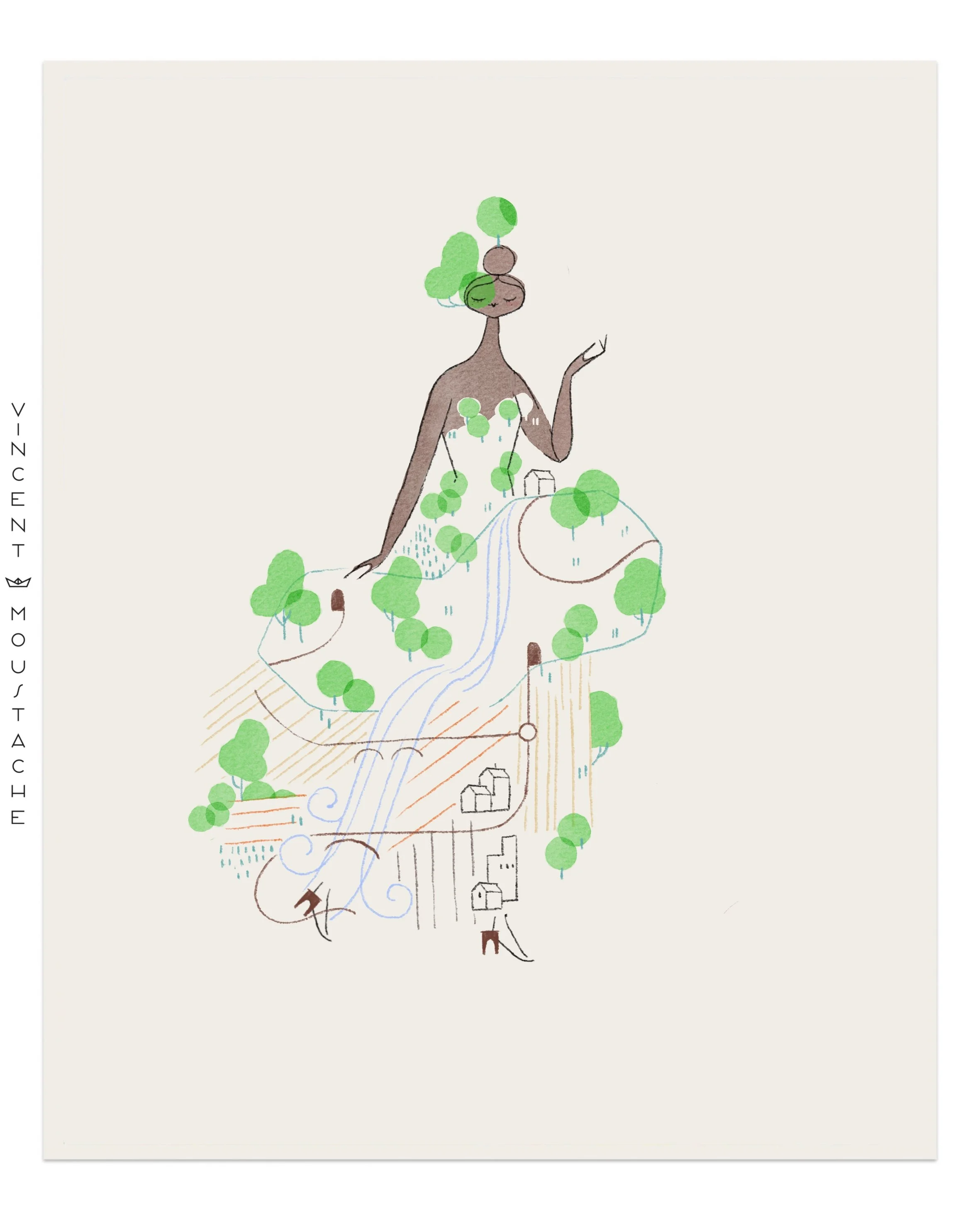
THE NATURAL MAP
Ever since I was little, I've been fascinated by how mountain elevations are represented on maps: concentric lines indicating the rise or fall of the terrain. It is one of the most abstract and beautiful representations that exist. Looking at a mountain from the air—an unusual view—we wouldn't be able to see the slopes and drops due to vegetation and buildings. So much so that it is known that in the Amazon there are many hidden treasures because the vegetation covers everything, and sometimes mounds and ruins are discovered thanks to aerial scans. The function of illustration is to explain the world in a universal way, and that is why it is absolutely necessary in science. Once again, scientific illustration beats reality: reality 0 - illustration 1.
HISTORY OF MAPS
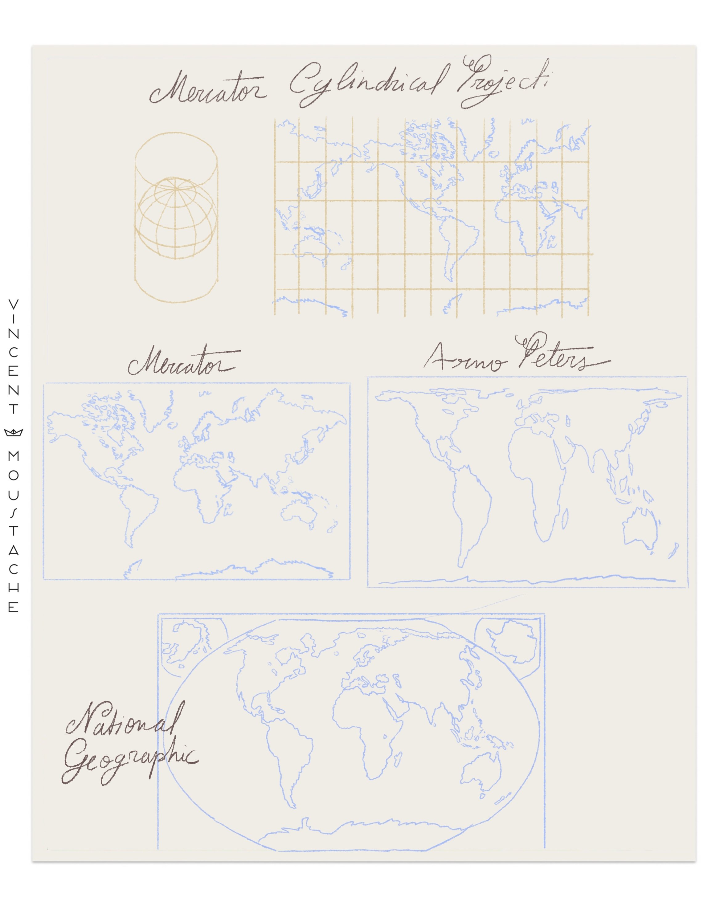
If we were to view Earth from above, we wouldn't see countries. You can't draw every single beach accurately; a gulf is simplified into a curve, and mountains are left out. A map is a summary. Nor can we see borders; borders are entirely imaginary. Explaining a map is explaining the world, and if someone explains the world to me, they explain where I am and who I am. The West knows this, which is why all the maps we know are Eurocentric/Western-centric: Europe is at the top and in the center (hierarchically superior), and this image was created thanks to the maps of early explorers, especially the Mercator projection.
Mercator is considered the father of modern cartography (1569) and was Dutch. The map he created is a cylindrical projection. In it, the European continent is represented in the center, large and at the top—proportionally much larger than the countries it historically colonized and exploited, including the enslavement of their inhabitants and the plundering of their resources: South America and Africa.
In the 20th century, in 1975, Arno Peters corrected that proportion and offered us a map closer to reality. In 1998, National Geographic developed a map based on Oswald Winkel's 1921 projection. This map produces the fewest distance errors and is the most widely used today. Unfortunately, most maps we still use in primary education and those we see on globes continue to use the Mercator projection.